
NWH Signage and Facility Branding Guidelines

APPLYING BRAND VALUES TO THE WORKPLACE
The NWH brand essence, “Simple. Natural. Hardwoods.”, is at the core of everything
we do. It not only guides our behaviors and actions, but also serves as the lens through which
all decisions about brand representation should be considered. This is equally true with the
branding of the built environment.
Both employees and stakeholders interact with our work environments every day. Because
of this, representing our brand consistently in all of our locations is essential. A consistently
represented brand, and brand story, fosters a consistent corporate culture, empowering every
employee to live our Values.
These guidelines are intended for new and existing facilities and workplace environments that require updating.


LOGO COMPONENTS & USE
Logos should be used judiciously as they are reserved only to identify company buildings, locations and main entrances. Interior uses include: main lobbies; in conjunction with brand messaging; adjacent to brand graphics and imagery; or included in digital broadcasts. Logos can be backlit or externally illuminated. For full guidance on the logo’s font, color, sizing and placement, please refer to the visual system guidelines.
LOGO SIZE & PLACEMENT
In applications with extensive horizontal or vertical clear space, alternate minimums are acceptable. These situations should be reviewed on a case-by-case basis, with visibility as the primary concern.
Signage: Minimum height
For signs with an abundance of horizontal space, the logo is allowed to extend closer to the clear space’s vertical boundary than in standard application.
Signage: Minimum width
Similarly, for signs with an abundance of vertical space, the logo is allowed to extend closer to the clear space’s horizontal boundaries than in standard application.
Signage: Corner applications
In situations where the logo is placed in the corner of a sign or building, additional clear space is required. This extra space prevents the logo from appearing to crowd the corner.
Brand Walls: Small
For brand walls between 8-12 ft. wide, a logo with a cap height of 6 in. is preferred. The base of the logo should always be at a minimum of 5 ft. above the finished floor height.
Brand Walls: Large
For brand walls between 16-20 ft. wide, a logo with a cap height of 9 in. is preferred. The base of the logo should always be at a minimum of 5 ft. above the finished floor height.
LOGO COLORS & MATERIALS
The primary installation of the logo should be the corporate green version against light backgrounds. Additionally, the white version of the logo against a dark background is acceptable. Logos rendered in architectural materials should be considered on a case-by-case basis (hardwoods, stainless steel, aluminum, embossed other natural materials, etc.).
Preferred: color positive
The preferred logo colors are PMS 349 Green for the mark. This color treatment should be used whenever possible. For the best visibility, this treatment should be mounted against a light-colored background.
Preferred: reverse
For visibility, a reverse logo may be used on dark-colored backgrounds or materials.
Alternate: Architectural materials with reversed or color logo
A logo reproduced with architectural materials should only be implemented in specialized situations. When this version of the logo is used, either the mark remains green and is rendered in a material, or the mark is rendered in the same material. Always consider visibility when choosing the logo materials. Applications and materials should be reviewed on a case-by-case basis.
LOGO EXTERIOR APPLICATIONS
Although not required, the logo can be used for highlevel building identification in multiple formats. These formats include, but are not limited to, signs attached to the building, freestanding monument or pylon signs and wayfinding signs. Visibility and other site conditions should be considered for proper placement and construction of all signage.
The logo colors should be chosen with visibility in mind, especially for large-format signage. Additionally, for building signage the logo should fit within the existing architectural context. This prevents the sign from detracting from the overall building aesthetic.
Large-scale logo illumination
The logo should always be clearly illuminated. The logo can be backlit or externally illuminated. The color principles for exterior building signage follow the same guidelines as the interior. The primary installation of the logo should apply the green version against light backgrounds. Additionally, the white version of the logo against a dark background is also acceptable. Logos or signage rendered in architectural materials should be considered on a case-by-case basis.
Possible logo color combinations:
• Preferred: color positive
• Preferred: reverse
• Alternate: Architectural materials color
• Alternate: Architectural materials reversed
EXTERIOR BUILDING SIGN DESCRIPTORS
There is special guidance for signage describing specific NWH business and operating units and assets. Descriptor lines can be added to the NWH corporate logo to specify a business unit name, product or location. Company descriptors can be translated to foreign languages as needed.
Primary colors
NWH signage should apply the primary brand colors whenever possible (green). Further guidance on color and material can be found below in the color section of these guidelines.
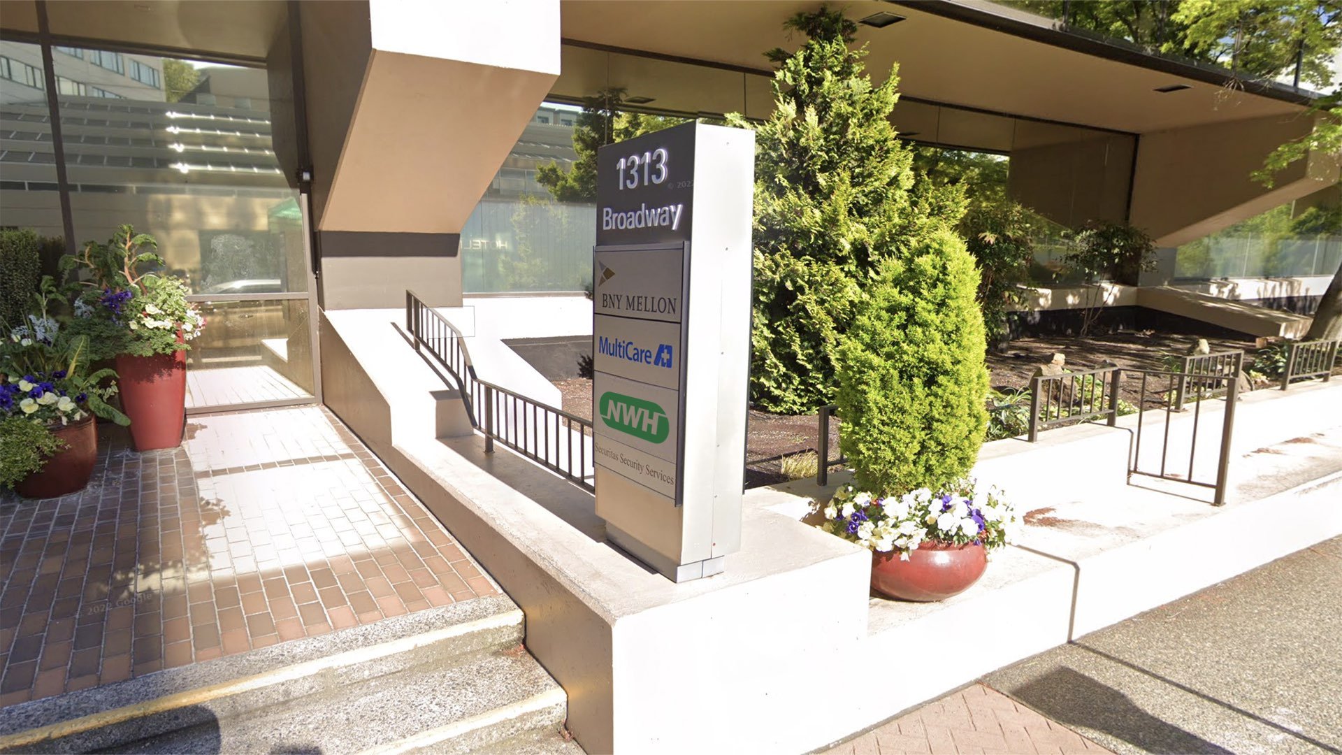
FREESTANDING SIGNS
Monument and pylon signs
Freestanding signs can be horizontal (monument) or vertical (pylon). Graphic rules for color, clear space and proportionality apply. For horizontal monument signs, the logo and any additional information should be mounted above any existing and future landscaping.
All freestanding signage should be illuminated for high visibility at night. This illumination can come from external ground lighting or from backlit letters. An approved combination of lighting methods is also acceptable.
Where applicable, the building address should be incorporated into freestanding signage. The font type, size and color should conform to our graphic guidelines. The building address should never appear to be “locked up” with the logo but can appear elsewhere on the sign.
Monument and pylon signs with business and operating units and assets
Where applicable, business and operating unit typography and iconography should be incorporated into freestanding signage. The font type, size and color should conform to our graphic guidelines on brand architecture. Exceptions can be made due to potential visibility issues. These exceptions should be reviewed on a case-by-case basis.
FREESTANDING SIGN COLORS
The color principles for exterior freestanding signage follow the same guidelines as all other signs. The primary installation of the logo should be the green version against light backgrounds.
Additionally, the white version of the logo against a green or a dark background is also acceptable. Logos or signage rendered in architectural materials should be considered on a case-by-case basis. Logos can be backlit or externally illuminated.
Wayfinding signage
The logo can be incorporated into exterior wayfinding signage. The colors, graphics and fonts used should conform to graphic standards. The text for wayfinding signage should be left-justified for ease of reading.
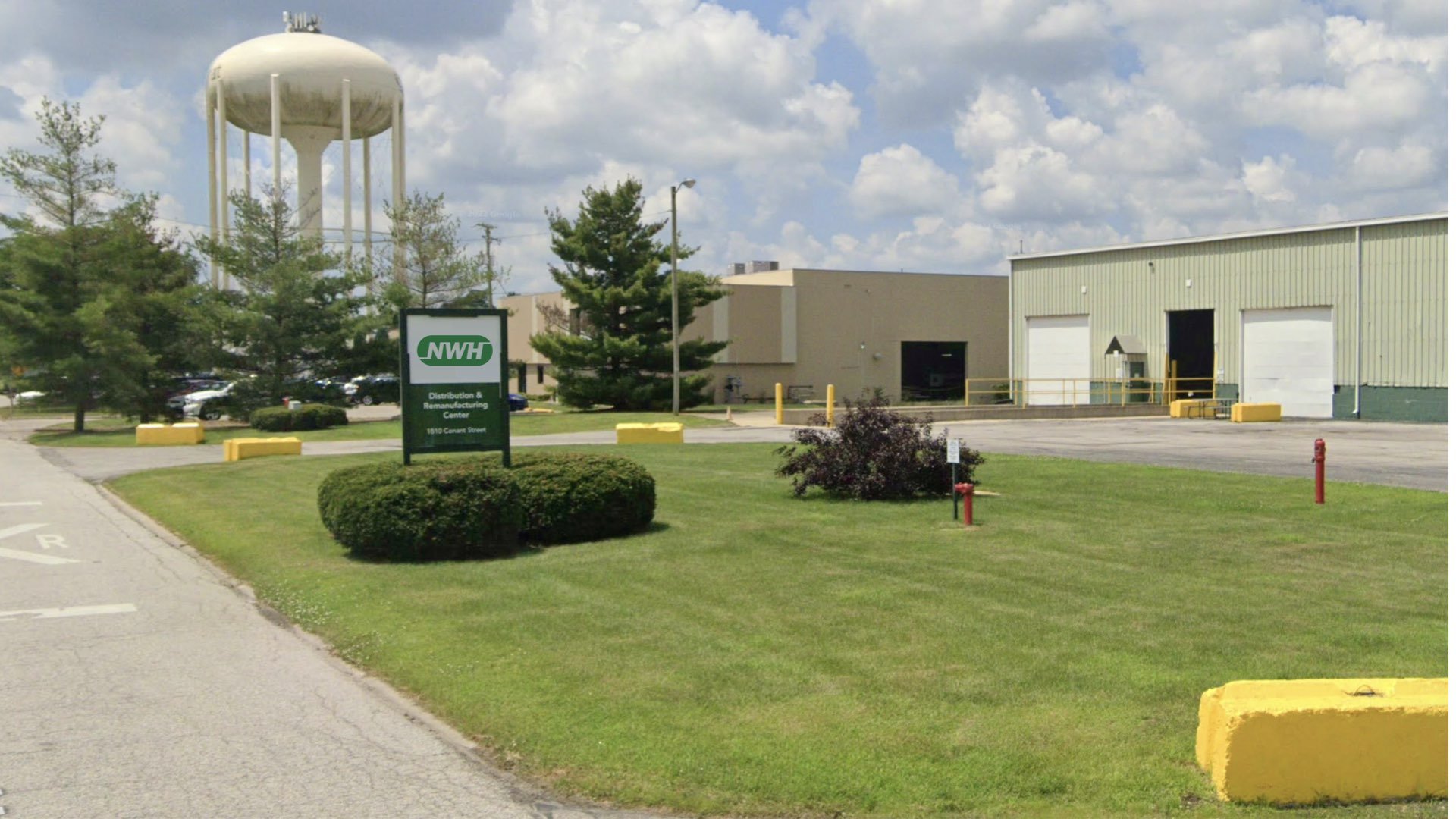
MISCELLANEOUS SIGNAGE APPLICATIONS
When applicable, the NWH logo can be applied at field worksites and any work areas surrounded by fencing. The sign material can be a metal sheet, or for temporary locations, an industrial-grade vinyl. The proportion should be similar to the monument sign and the logo should always be surrounded by the minimum amount of clear space.
When business and operating units and assets are included in signage, the placement should conform to the brand architecture guideline. Exceptions can be made for potential visibility issues. Any alternates should be reviewed on a case-by-case basis.

Color

Color Application
The distinctive shape of the NWH logo is further distinguished by its color. Color plays a significant part in shaping the NWH identity. The color palette consists of two primary colors. The preferred reproduction is in matching inks. Swatches should be used for visual match in offset printing and other reflective reproduction techniques. Use the full-color treatment of the logo on fields of white whenever possible, as this maximizes the impact of the brand and more effectively supports brand recognition.
Where it is not possible to use the full-color treatment of the logo, a reverse treatment of the logo on fields of color and one-color black presentations of the logo are preferred. The black-and-white logo is used for applications that do not warrant the expense of color reproduction or when convention calls for black-and-white reproduction. In one-color marketing and product literature, the ideal one-color application of the logo is reversed to white on a field of color.
Highlighting important interior elements
A wall highlighted in NWH green is a powerful backdrop for important brand areas like collaborative spaces, break areas or lobbies. Additionally, furniture can be rendered in our NWH green. This furniture application is limited to approved interior areas like breakrooms. In order not to minimize the impact of our NWH green color, it should never be used for purely utilitarian purposes. This is especially true for functional finishes, furniture and equipment. Items such as counter tops, garbage cans and task chairs should not be custom colored to our NWH green.
Reverse Treatment
The black & white logo is used for applications that do not warrant the expense of color reproduction or when convention calls for black & white reproduction. For example: instruction manuals, black and white advertising, one color labels, etc.
Materiality
Neutral tones and natural materials should be the predominant colors used in all workplace environments and for functional elements. The overuse of primary and secondary brand colors can overwhelm the space.

Color Specifications.
Use the full-color treatment of the logo on white whenever possible, as this optimizes the impact of the brand and more effectively supports brand recognition. For maximum visibility, the full-color logo should appear on a white background. It is also very effective when shown in white reversed out of the primary palette.
Electronic & Video
Color created through transmitted light on a monitor or a television screen is composed of three primary colors: red, green and blue (RGB). RGB color is produced electronically, the overall color quality will tend to be more vivid than the printed color.
Please note: electronic color is more subjective than printed color. Temporary changes of light source, reflection from adjacent objects, manufacturer and age of screen all affect the color appearance.
Primary Color Palette
The color palette consists of three primary colors. Please refer to the chart below when using NWH primary colors. If the piece is part of a four-color process reproduction, the colors should be created with CMYK screen tints. If the identity is part of an electronic medium such as the web, broadcast or PowerPoint, the colors should be created with RGB values.
Custom Paint Colors
NWH brand colors can be converted from PANTONE to paint colors. The colors used should remain as true to the standard as possible.


Usages to Avoid.


Typography.

Typography.
The typographic style relies on a primary typeface of Univers Light Pro. Univers 55 Roman should be used for body copy. These typefaces are to be used for corporate applications such as the letterhead system and business cards, form titles, and signage. In addition, digital and print advertising should utilize the same typeface — except for campaigns.
Univers LT Pro 45 Light is available for purchase at
https://www.myfonts.com/fonts/linotype/univers/pro-45-light
Univers 55 Roman is available for purchase at
https://www.myfonts.com/fonts/linotype/univers/pro-55-roman/
ITC Franklin Gothic Heavy Italic is available for purchase at
https://www.myfonts.com/fonts/itc/franklin-gothic/franklin-got-medium-heavy-italic/


Logo Files
File Types.
Choosing a File Type
The correct use of the NWH identity is one responsibility we all share. Reproduction artwork is provided for easy use. Before choosing the file format, confirm the final use of the logo.
Vector Files
Vector files are used for print reproduction and for incorporation into Microsoft software applications (e.g. Word and PowerPoint). Vector files may be scaled up and down within an unlimited specified size range. (EPS, PDF).
Bitmap Image Files
Bitmap files are composed of pixels for use on a display screen. These files are composed in CMYK (cyan, magenta, yellow, black) & RGB (red, green, blue) for use in interactive, video or TV applications. These files should not be enlarged, as a jagged edge will appear. Never use a bitmap file for print reproduction. (JPG, PNG)

Logo Libraries
-

Logo
NWH Logo
This collection of logos should be utilized when referring to NWH.
